[Day 21] Unsupervised Machine Learning Type 4 - Principal Component Analysis(PCA) (with a Small Python Project)
Too many features? PCA squeezes your data into 2 smart axes—keeping the patterns, ditching the noise. 💡📉
![[Day 21] Unsupervised Machine Learning Type 4 - Principal Component Analysis(PCA) (with a Small Python Project)](https://storage.ghost.io/c/55/e8/55e827ca-bf8d-4eee-bdb4-ee48e49a011a/content/images/size/w2000/2025/03/PCA.svg)
🎯 What is PCA?
PCA (Principal Component Analysis) is a technique used to reduce the number of features in your data without losing the important information.
Think of it like:
“I have 8 columns of data. Can I shrink it to 2 or 3 powerful ones that explain most of what’s happening?”
That’s exactly what PCA does:
- It compresses your data smartly.
- Keeps the patterns.
- Helps in faster processing, better visualization, and reducing noise.
🌍 Why is PCA Useful in Real Life?
✅ When your dataset has too many columns (a.k.a high-dimensional).
✅ When features are correlated or repetitive.
✅ When you want to visualize complex data in 2D or 3D.
See video below for better understanding:
🔍 Real-World Examples
🏦 1. Fraud Detection (Banking)
- 8+ transaction attributes like amount, device score, time, etc.
- PCA compresses them into 2 key components.
- Helps visualize and flag abnormal behavior.
🧬 2. Healthcare - Disease Pattern Recognition
- Thousands of gene expressions for patients.
- PCA helps extract the 2–3 most significant patterns.
- Aids in clustering or diagnosis.
🛍️ 3. Customer Behavior Analysis
- Retailers track browsing, purchases, app activity.
- PCA simplifies the customer profile while retaining behavioral signals.
🖼️ 4. Image Compression / Face Recognition
- An image has thousands of pixels.
- PCA converts them into a few ‘Eigenfaces’ — compressed faces that still carry identity!
🔧 How PCA Works (Step-by-Step)

Step 1: Standardize the Data
👉 Features must be on the same scale.
Step 2: Find Directions of Maximum Variance
👉 PCA finds the axes (principal components) where data varies the most.
Step 3: Project the Data onto New Axes
👉 The data is re-expressed using fewer features.
🎯 Result: Smaller data, same meaning. Ready for clustering, anomaly detection, or modeling.
🖥 Python
Mini Project: SmartSqueeze: PCA-Based Financial Data Compression
Imagine you're a data analyst at a fintech company. You’ve received transaction logs containing 8 features per transaction like:
- Amount
- Hour of day
- Device Score
- Whether the user has previously committed fraud
- Risk score of the merchant
- Customer tenure
- Number of transactions in the last 30 days
- Location variance
That’s a lot of dimensions to look at — especially if you want to detect patterns or visualize user behavior.
➡️ So you use PCA to reduce it to just 2 powerful features (PCA1 & PCA2).
Dataset:
📊 Enhanced Transaction Dataset (35 Rows × 8 Features)
| Transaction ID | Amount ($) | Hour | Device Score | Prev Fraud (0/1) | Location Variance | Merchant Risk Score | Customer Tenure (Years) | Num Transactions (30d) |
|---|---|---|---|---|---|---|---|---|
| 1 | 1252 | 0 | 0.80 | 0 | 0.43 | 0.03 | 7 | 3 |
| 2 | 4866 | 12 | 0.64 | 0 | 1.88 | 0.88 | 4 | 2 |
| 3 | 4150 | 8 | 0.67 | 1 | 0.50 | 0.88 | 4 | 27 |
| 4 | 1862 | 5 | 0.72 | 1 | 1.33 | 0.61 | 4 | 14 |
| 5 | 5291 | 0 | 0.79 | 0 | 1.14 | 0.72 | 2 | 3 |
| 6 | 3624 | 1 | 0.42 | 0 | 1.68 | 0.42 | 5 | 27 |
| 7 | 3439 | 14 | 0.69 | 0 | 1.64 | 0.95 | 7 | 45 |
| 8 | 2388 | 2 | 0.44 | 0 | 1.90 | 0.76 | 1 | 20 |
| 9 | 1363 | 7 | 0.59 | 0 | 1.58 | 0.69 | 5 | 33 |
| 10 | 1940 | 2 | 0.57 | 1 | 1.23 | 0.83 | 5 | 12 |
| 11 | 4075 | 20 | 0.52 | 1 | 0.88 | 0.36 | 6 | 45 |
| 12 | 5682 | 20 | 0.65 | 1 | 0.95 | 0.73 | 1 | 1 |
| 13 | 1898 | 21 | 0.90 | 0 | 1.10 | 0.41 | 3 | 18 |
| 14 | 2251 | 15 | 0.45 | 0 | 1.30 | 0.98 | 4 | 37 |
| 15 | 3167 | 7 | 0.62 | 0 | 1.36 | 0.51 | 7 | 15 |
| 16 | 1194 | 0 | 0.42 | 0 | 0.99 | 0.96 | 0 | 20 |
| 17 | 1053 | 7 | 0.88 | 0 | 0.44 | 0.46 | 6 | 8 |
| 18 | 2901 | 5 | 0.60 | 1 | 0.92 | 0.34 | 3 | 41 |
| 19 | 2776 | 9 | 0.74 | 1 | 0.66 | 0.93 | 8 | 26 |
| 20 | 1115 | 3 | 0.79 | 0 | 0.21 | 0.91 | 6 | 1 |
| 21 | 2912 | 4 | 0.97 | 0 | 1.09 | 0.21 | 6 | 18 |
| 22 | 4438 | 9 | 0.60 | 0 | 1.63 | 0.51 | 4 | 17 |
| 23 | 4333 | 3 | 0.72 | 0 | 1.17 | 0.89 | 4 | 3 |
| 24 | 2874 | 2 | 0.72 | 0 | 0.51 | 0.20 | 0 | 12 |
| 25 | 1454 | 5 | 0.80 | 0 | 1.85 | 0.46 | 3 | 47 |
| 26 | 4688 | 1 | 0.33 | 0 | 0.73 | 0.52 | 7 | 10 |
| 27 | 4866 | 14 | 0.49 | 0 | 1.66 | 0.52 | 4 | 36 |
| 28 | 2795 | 7 | 0.79 | 0 | 0.62 | 0.90 | 5 | 7 |
| 29 | 2063 | 19 | 0.35 | 1 | 1.81 | 0.74 | 4 | 8 |
| 30 | 3517 | 22 | 0.26 | 0 | 1.88 | 0.34 | 3 | 44 |
| 31 | 4314 | 2 | 0.95 | 0 | 0.36 | 0.10 | 4 | 15 |
| 32 | 2545 | 4 | 0.63 | 0 | 0.29 | 0.93 | 6 | 35 |
| 33 | 1720 | 23 | 0.90 | 0 | 0.17 | 0.29 | 0 | 48 |
| 34 | 4646 | 6 | 0.38 | 1 | 0.97 | 0.29 | 4 | 16 |
| 35 | 1684 | 0 | 0.56 | 1 | 0.53 | 0.92 | 6 | 18 |
You can save it as enhanced_transaction_data.csv
📝 Python Code:
import pandas as pd
import matplotlib.pyplot as plt
import seaborn as sns
from sklearn.preprocessing import StandardScaler
from sklearn.decomposition import PCA

# Step 1: Load the data
data = pd.read_csv("enhanced_transaction_data.csv")

# Step 2: Select features for PCA
features = ['Amount ($)', 'Hour', 'Device Score', 'Prev Fraud (0/1)',
            'Location Variance', 'Merchant Risk Score',
            'Customer Tenure (Years)', 'Num Transactions (30d)']
X = data[features]

# Step 3: Standardize the features
scaler = StandardScaler()
X_scaled = scaler.fit_transform(X)

# Step 4: Apply PCA to reduce to 2 components
pca = PCA(n_components=2)
components = pca.fit_transform(X_scaled)
data['PCA1'] = components[:, 0]
data['PCA2'] = components[:, 1]

# Step 5: Visualize the PCA projection
plt.figure(figsize=(10, 6))
sns.scatterplot(
    x='PCA1',
    y='PCA2',
    data=data,
    hue='Prev Fraud (0/1)',
    palette='coolwarm',
    s=100,
    edgecolor='black'
)
plt.title('PCA Projection of Transaction Data')
plt.xlabel('Principal Component 1')
plt.ylabel('Principal Component 2')
plt.grid(True)
plt.legend(title='Previous Fraud')
plt.tight_layout()
plt.show()
Result:
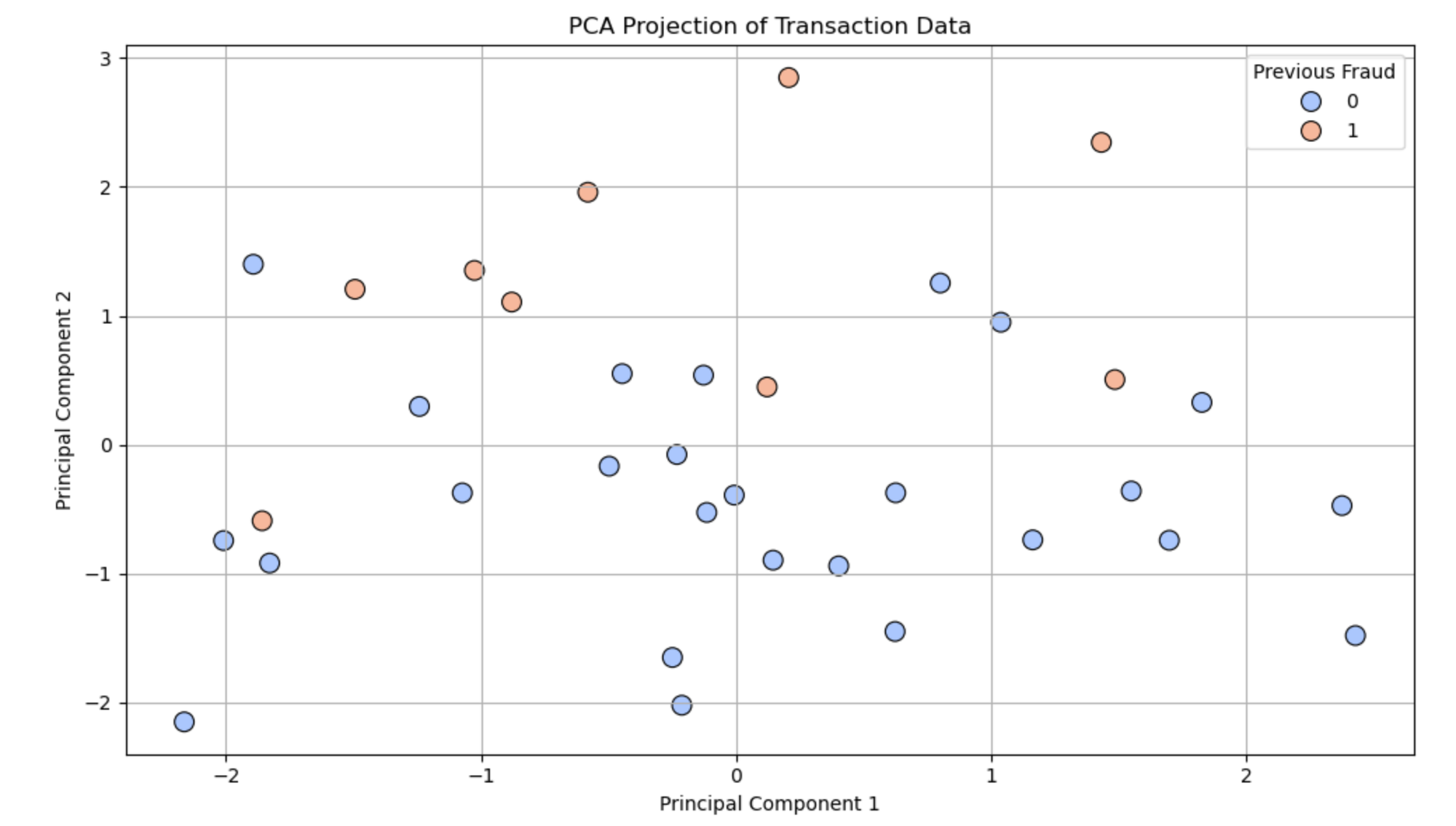
🔬 What Do PCA1 and PCA2 Represent?
- PCA1 (Principal Component 1): This new feature captures the maximum variation in the data. It’s a combination of the original 8 features.
- PCA2 (Principal Component 2): This captures the second most important direction of variation, uncorrelated with PCA1.
Together, PCA1 and PCA2 give you a compressed view of your data — 2 dimensions that explain the most meaningful behavior across all 8 features.
They are not just one feature like "Amount" or "Hour" — they are mathematical combinations of all features weighted by their importance.
🔎 What the PCA Graph Tells You:
- Each point = a transaction
- Position in the PCA1–PCA2 space = summary of all 8 features
- Color = fraud label (0 = No fraud, 1 = Fraud)
✅ Insights You Can Get:
- Fraudulent transactions may appear as separate clusters or outliers.
- Transactions with similar patterns are grouped together.
- You can zoom in on suspicious zones or investigate clusters.
Nutshell
- PCA1 & PCA2 are not original features, but powerful summaries of your data.
- PCA helps you visualize high-dimensional data and find meaningful patterns.
- It’s advantageous before applying clustering (like DBSCAN) or anomaly detection.
💬 Join the DecodeAI WhatsApp Channel for regular AI updates → Click here