[Day 23] Unsupervised Machine Learning Type 6 – t-SNE (with a Small Python Project)
t-SNE is like unfolding a messy ball of song data into a beautiful 2D map—see genres, patterns & outliers with just one glance! 🎶🧠
![[Day 23] Unsupervised Machine Learning Type 6 – t-SNE (with a Small Python Project)](https://storage.ghost.io/c/55/e8/55e827ca-bf8d-4eee-bdb4-ee48e49a011a/content/images/size/w2000/2025/03/t-SNE.svg)
🎯 What is t-SNE?
t-SNE, or t-distributed Stochastic Neighbor Embedding, is a powerful tool for taking complex, high-dimensional data, like a dataset with dozens or hundreds of features, and squashing it down into something you can actually see, like a 2D or 3D plot.
Think of it as a way to "unfold" a messy ball of data so you can spot patterns, clusters, or weird outliers. Unlike PCA, which zooms out to keep the big picture intact, t-SNE zooms in—it’s obsessed with keeping nearby points nearby in the lower-dimensional version, even if it has to twist and stretch the global layout to do it.
Example: Imagine you’ve got customer data with tons of variables: age, income, purchase history, website clicks, time spent browsing, etc. That’s a multidimensional nightmare. t-SNE can map it to a 2D scatterplot where each dot is a customer, and customers with similar habits end up bunched together. It’s less about exact distances and more about who’s hanging out with who.
⚡ Why Use t-SNE? Real-World Style
- Visualize the Unseeable: Got a dataset with 50 columns? t-SNE turns it into a picture you can slap on a slide for your boss or team.
- Find the Tribes: It’s great for spotting natural groups—like which customers are secretly the same “type” based on behavior, not just demographics.
- Catch the Weirdos: Outliers pop out like sore thumbs. Maybe it’s a bot, a fraudster, or just someone who bought 500 cat toys in one go.
- Prep for the Big Guns: Before you run clustering (like k-means) or train a model, t-SNE helps you eyeball what’s worth digging into.
⚡ Why t-SNE Rocks in the Real World
- Reveals Hidden Stories: Say you’re analyzing social media users. t-SNE might show you clusters of “sports fanatics,” “memelords,” or “crypto bros” based on their activity—stuff you’d never guess from raw numbers.
- Explains Models to Humans: Your neural network says these 10 people are “high risk.” t-SNE can plot why—maybe they’re all clumped near shady transaction patterns.
- Debugs Your Data: Working with sensor data from a factory? t-SNE might show a weird blob of “faulty machine” readings you didn’t know existed.
- Everyday Examples:
- Biology: Plotting gene expression data to see which cells are acting alike (e.g., cancer vs. healthy).
- Marketing: Mapping customer preferences to figure out who’s into sneakers vs. luxury bags.
- Security: Visualizing network traffic to spot hacker patterns vs. normal users.
Python Project Name: Song Type Identifier
Imagine you’ve got a playlist of thousands of songs, each with features like tempo, volume, and genre. You want to visualize how all these songs relate to each other, but there’s a catch: those features live in a high-dimensional space (think 10+ variables), and your screen or paper is just 2D or 3D. How do you squish all that info down without losing the vibe? Let’s say we’re analyzing a data set of 25 songs,is for example, and we’ll simplify it to make it clear how t-SNE works and what the result looks like.
Each song is Let'sdescribed by 5 features:
- Tempo (beats per minute, e.g., 60 BPM for slow, 180 BPM for fast)
- Loudness (in decibels, e.g., -10 dB for quiet, 0 dB for loud)
- Danceability (a score from 0 to 1, how easy it is to dance to)
- Energy (a score from 0 to 1, how intense it feels)
- Genre (encoded as numbers, e.g., 1 for pop, 2 for rock, 3 for hip-hop, etc.)
This is a 5-dimensional dataset—each song is a point in a 5D space, which is impossible to visualize directly because our brains (and screens) max out at 3D.
Let's see it in 2D space.
Data set: Save it as songs_list.csv
Dataset
| Tempo | Loudness | Danceability | Energy | Genre |
|---|---|---|---|---|
| 120.5 | -7.8 | 0.85 | 0.62 | Pop |
| 115.2 | -6.5 | 0.90 | 0.58 | Pop |
| 130.1 | -8.2 | 0.82 | 0.65 | Pop |
| 125.7 | -7.0 | 0.88 | 0.60 | Pop |
| 118.9 | -9.1 | 0.87 | 0.59 | Pop |
| 175.3 | -3.2 | 0.25 | 0.92 | Rock |
| 168.9 | -4.1 | 0.30 | 0.88 | Rock |
| 180.2 | -2.8 | 0.22 | 0.95 | Rock |
| 172.4 | -3.9 | 0.28 | 0.90 | Rock |
| 165.7 | -4.5 | 0.33 | 0.87 | Rock |
| 88.4 | -5.6 | 0.70 | 0.73 | Hip-Hop |
| 92.1 | -4.9 | 0.68 | 0.75 | Hip-Hop |
| 85.6 | -6.2 | 0.72 | 0.71 | Hip-Hop |
| 95.3 | -5.1 | 0.65 | 0.78 | Hip-Hop |
| 90.8 | -4.7 | 0.69 | 0.74 | Hip-Hop |
| 60.2 | -18.5 | 0.15 | 0.21 | Ambient |
| 58.9 | -17.2 | 0.12 | 0.19 | Ambient |
| 62.7 | -19.0 | 0.10 | 0.23 | Ambient |
| 59.4 | -16.8 | 0.14 | 0.20 | Ambient |
| 61.1 | -18.0 | 0.13 | 0.22 | Ambient |
| 122.3 | -7.5 | 0.83 | 0.63 | Pop |
| 170.8 | -3.6 | 0.27 | 0.89 | Rock |
| 87.9 | -5.8 | 0.71 | 0.72 | Hip-Hop |
| 63.5 | -17.8 | 0.11 | 0.24 | Ambient |
| 124.6 | -8.0 | 0.86 | 0.61 | Pop |
✅ Python Code
# Import Libraries
import pandas as pd
from sklearn.manifold import TSNE
import matplotlib.pyplot as plt
import seaborn as sns
from sklearn.preprocessing import StandardScaler

# Load the Dataset
df = pd.read_csv('songs_list.csv')

# Prepare Data for t-SNE
X = df[['Tempo', 'Loudness', 'Danceability', 'Energy']]
y = df['Genre']

# Standardize the Features
scaler = StandardScaler()
X_scaled = scaler.fit_transform(X)

# Apply t-SNE
tsne = TSNE(n_components=2, perplexity=5, random_state=42)
X_tsne = tsne.fit_transform(X_scaled)

# Create a DataFrame with t-SNE Results
tsne_df = pd.DataFrame(X_tsne, columns=['TSNE1', 'TSNE2'])
tsne_df['Genre'] = y

# Plot the Results
plt.figure(figsize=(10, 8))
sns.scatterplot(data=tsne_df, x='TSNE1', y='TSNE2', hue='Genre', palette='deep', s=100, alpha=0.7)
plt.title('t-SNE Visualization of 25 Songs Dataset')
plt.xlabel('t-SNE Dimension 1')
plt.ylabel('t-SNE Dimension 2')
plt.legend(title='Genre')
plt.grid(True)
plt.show()
Result:
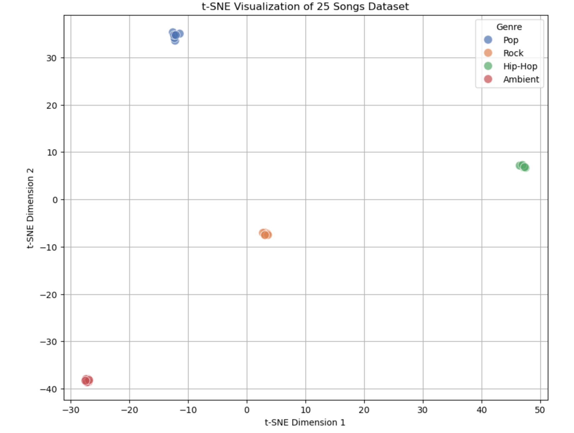
What the Output Graph Looks Like
When you run the code, you’ll see a 2D scatter plot with the following features:
- Axes:
- X-axis labeled "t-SNE Dimension 1" (TSNE1).
- Y-axis labeled "t-SNE Dimension 2" (TSNE2).
- These don’t represent specific features (like Tempo or Energy) but are new dimensions created by t-SNE to capture similarity.
- Points: 25 dots, each representing one song from the dataset.
- Colors: Each dot is colored based on its genre (e.g., blue for Pop, red for Rock, green for Hip-Hop, purple for Ambient—colors may vary depending on the seaborn palette).
Layout explanation:
- Clusters: You’ll likely see 4 distinct groups of points:
- Pop: Around 7 points clustered together (high danceability, moderate tempo).
- Rock: Around 6 points in a different area (high energy, fast tempo).
- Hip-Hop: Around 6 points grouped elsewhere (medium tempo, varied energy).
- Ambient: Around 6 points separated from the rest (low everything).
- Separation: The clusters won’t overlap much because t-SNE tries to keep similar songs close and dissimilar ones far apart.
Summary of the Output:
- What We See: Four clusters (Pop, Rock, Hip-Hop, Ambient) showing how 25 songs group by similarity in their 4 features.
- Useful Results: Confirmation that genres are distinct, with each cluster reflecting its feature profile (e.g., Rock = fast and loud, Ambient = slow and quiet).
- Practical Use: Explore data, recommend songs, validate features, or analyze genre relationships—all from a single, easy-to-read plot.
💬 Join the DecodeAI WhatsApp Channel for regular AI updates → Click here